Nhat Huong has supplied Vietnamese bakers since 1998. I joined the brand team to refresh its identity and packaging without discarding the chef's-hat mark or the red customers already knew.
Project details
CLIENTNhat Huong · est. 1998
ROLEDesigner · brand team
TIMELINE6 months · 2023
TOOLSPhotoshop · Illustrator
DeliveredA refreshed logo, eight color families, five product-group patterns, and packaging for cartons, tubs, sauces, and labels.
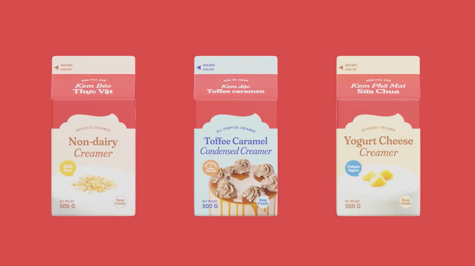
My partFive product-group shapes and patterns, eight color families, bilingual labels, and the creamer cartons.
Team work: I contributed to the manifesto and strategy, logo refinement, photography direction, and out-of-home and social systems.
THE SYSTEM AT A GLANCEIDENTITY + PACKAGING
1998
THE LEGACY BEING REFRESHED
8
COLOR FAMILIES, WITH TINT RAMPS
5
PRODUCT-GROUP SHAPES → PATTERNS
THE CLIENT GAVE US TWO HARD RULES
Keep the chef's-hat mark. Keep the red. The job was to make the rest of the system easier to recognize and use across a wide product range.
THE BRAND ALREADY HAD A REAL STORY
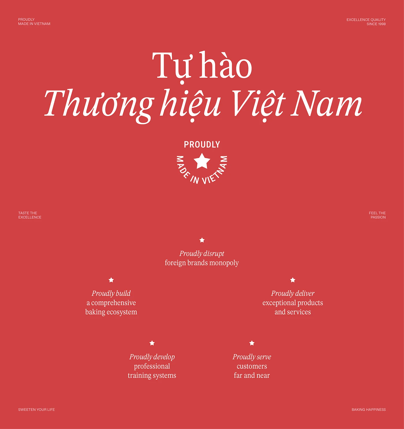
Nhat Huong trains and supplies bakers. I contributed to a strategy built around that role, and to the manifesto that opens with Tự hào Thương hiệu Việt Nam, meaning proudly a Vietnamese brand.
Client manifesto
REFINING THE MARK
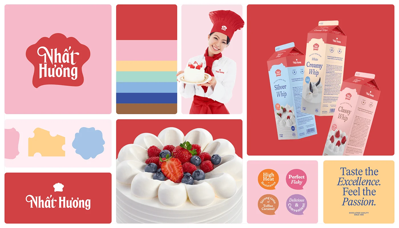
I contributed to the logo refinement with the team. We kept the hat silhouette and developed the lettering and lockups shown in the identity board.
Identity board
COLOR & TYPE
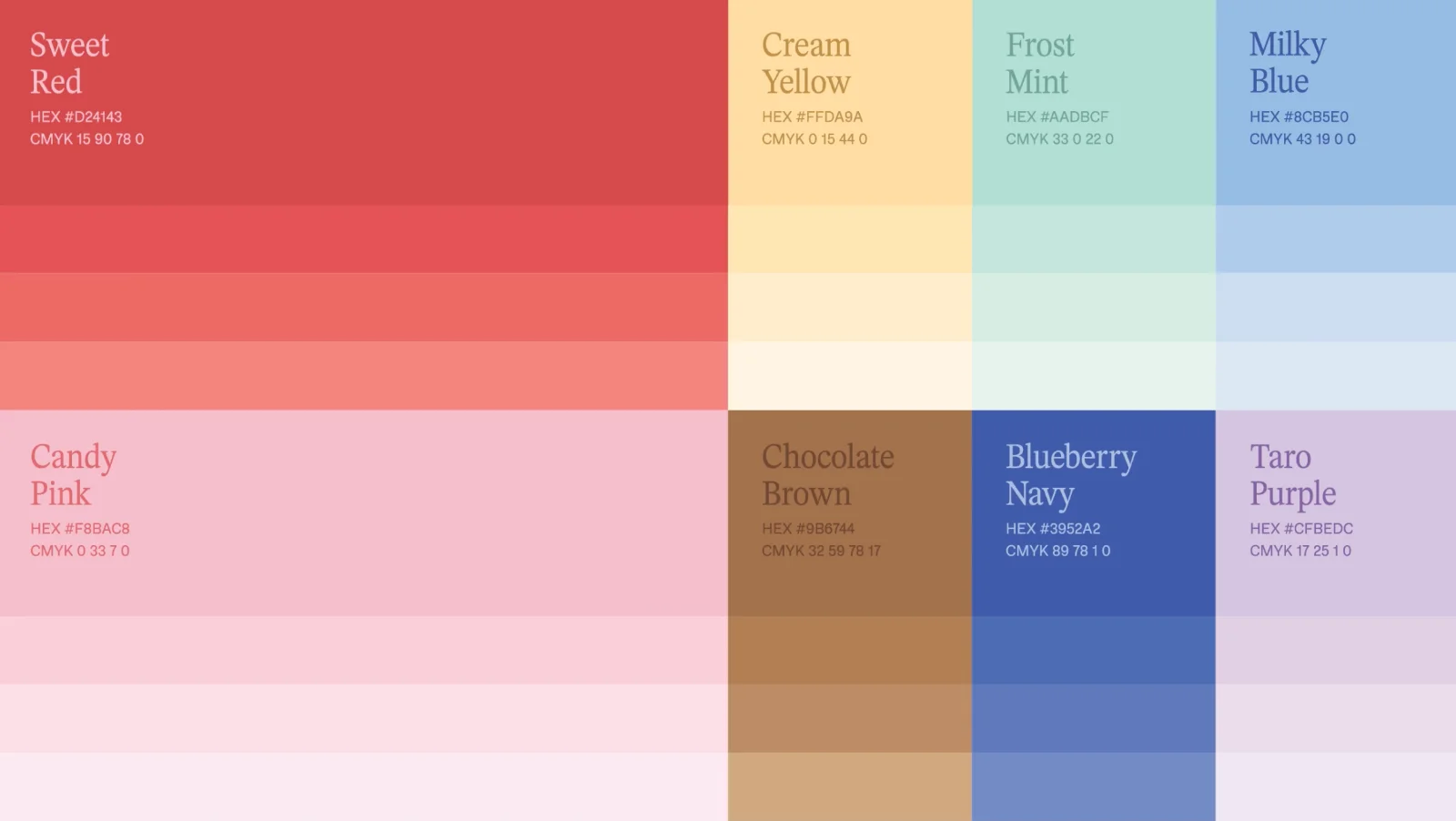
I developed eight color families, including their names and tint ramps. Red and pink form the primary pair; six supporting families distinguish the product lines:
Sweet Red & Candy Pink: the primary pair; heritage red, warmed up
Cream Yellow, Frost Mint, Milky Blue: the dairy-soft supporting range
Chocolate Brown, Blueberry Navy, Taro Purple: depth for premium lines
Type: Nhat Huong Serif, the brand's custom serif, for heritage headlines, with a clean sans for arm's-length reading.
Color specifications for print
GRAPHIC SYSTEM
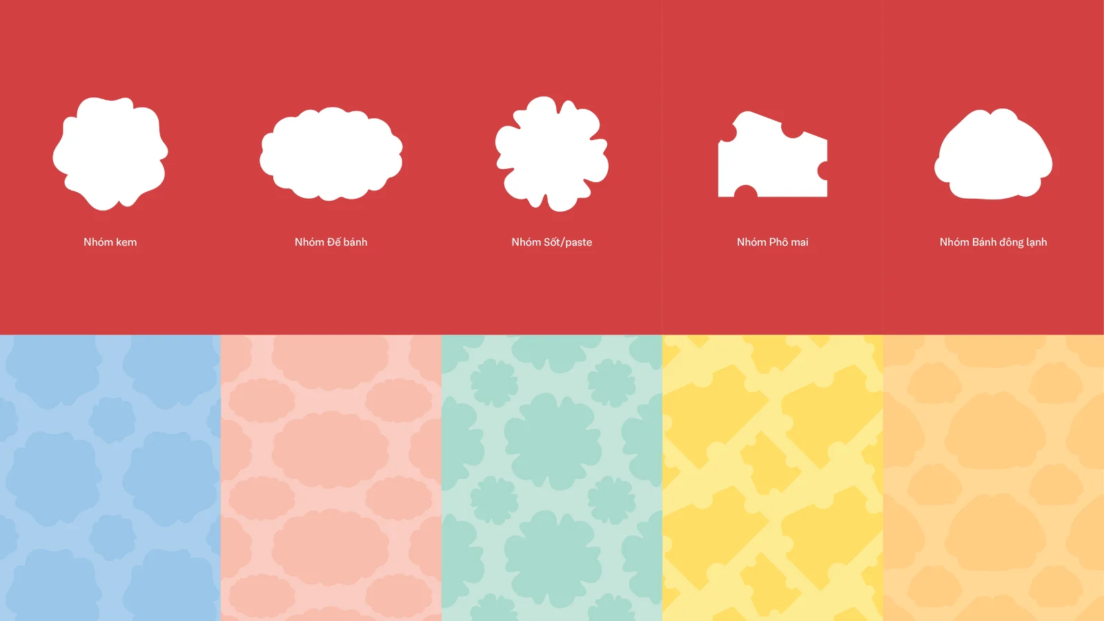
I drew five piped shapes for cream, cake base, sauce, cheese, and frozen products, then turned each into a repeat pattern. I paired color and pattern to help distinguish product groups at a glance.
My product-group shapes and patterns
PACKAGING
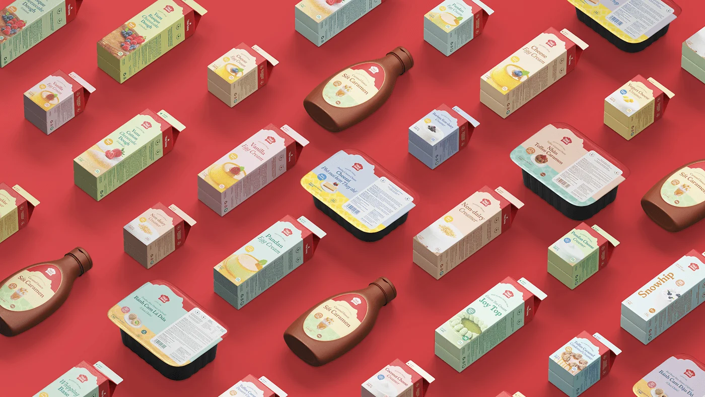
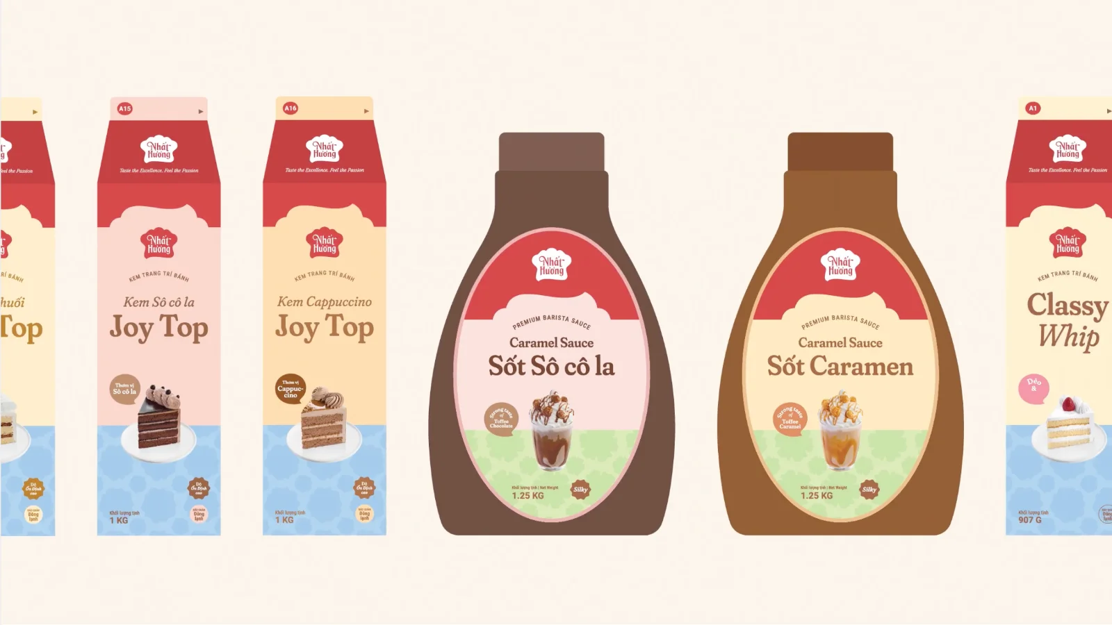
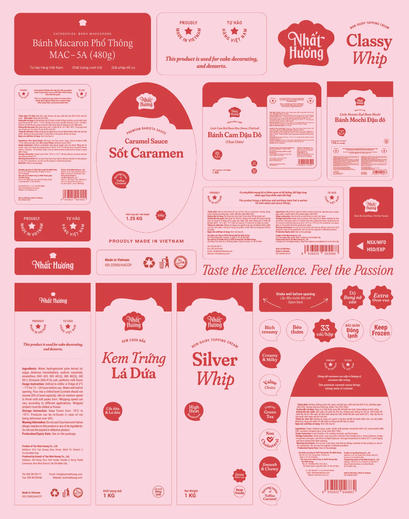
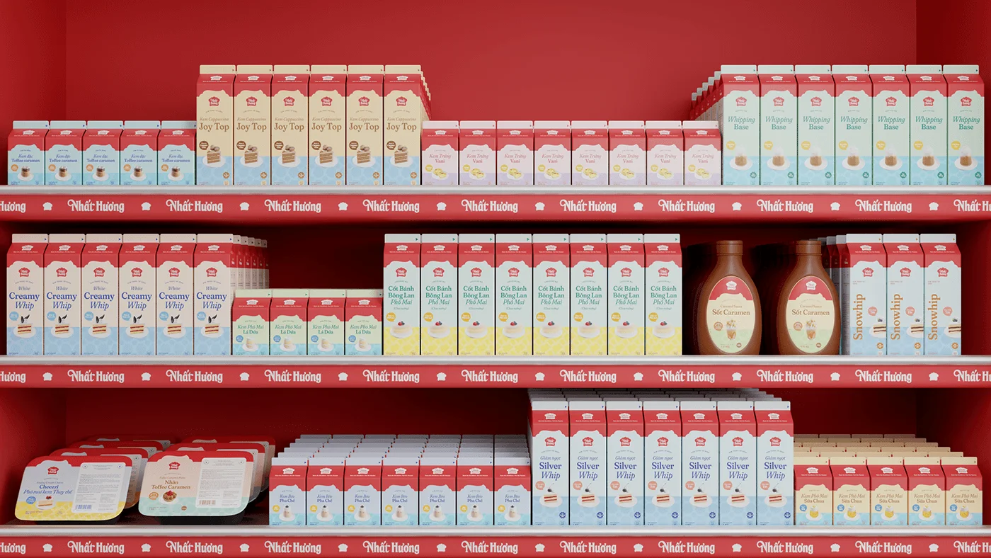
I designed the bilingual label system and the creamer cartons. The wider packaging range was developed with the team, using the same colors, patterns, and label structure:
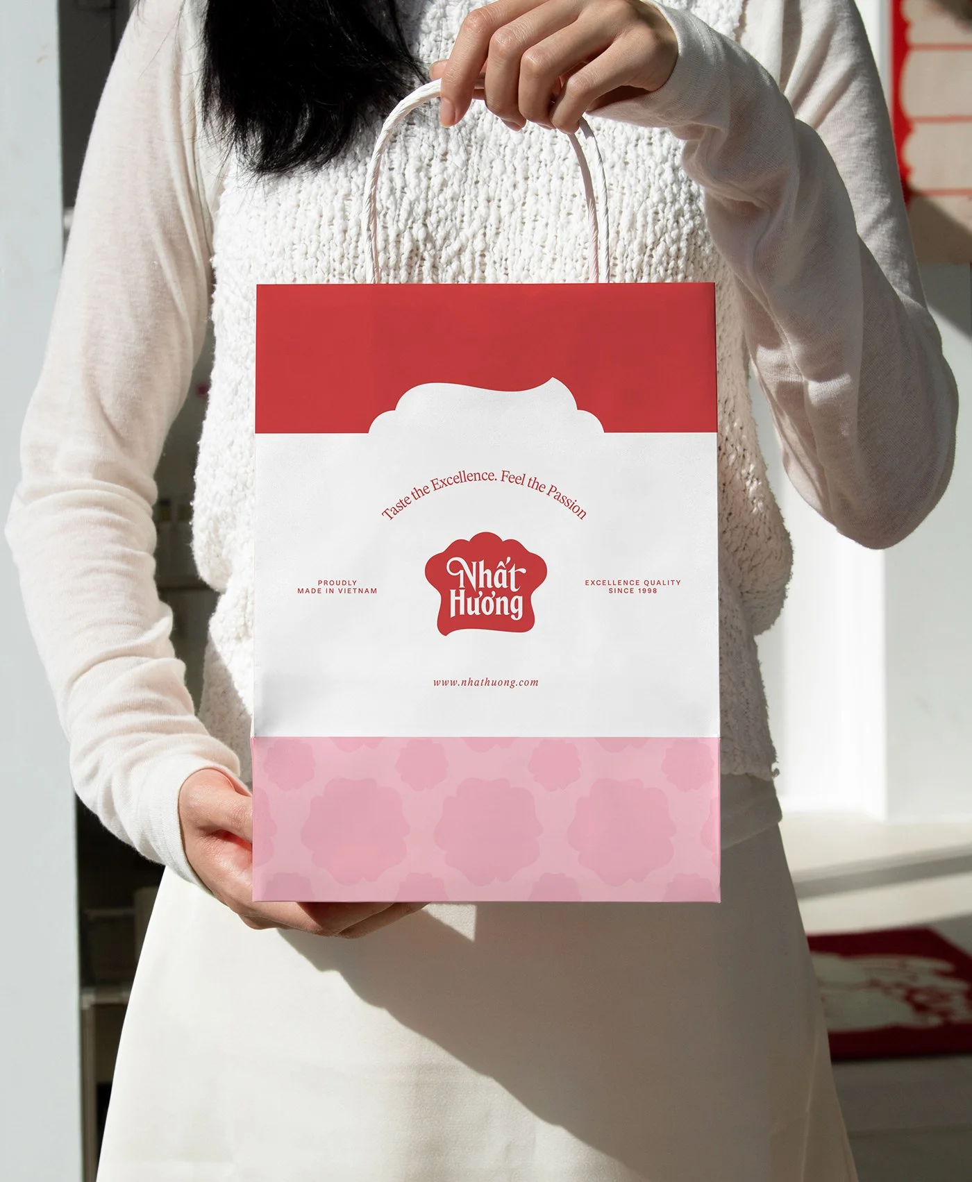
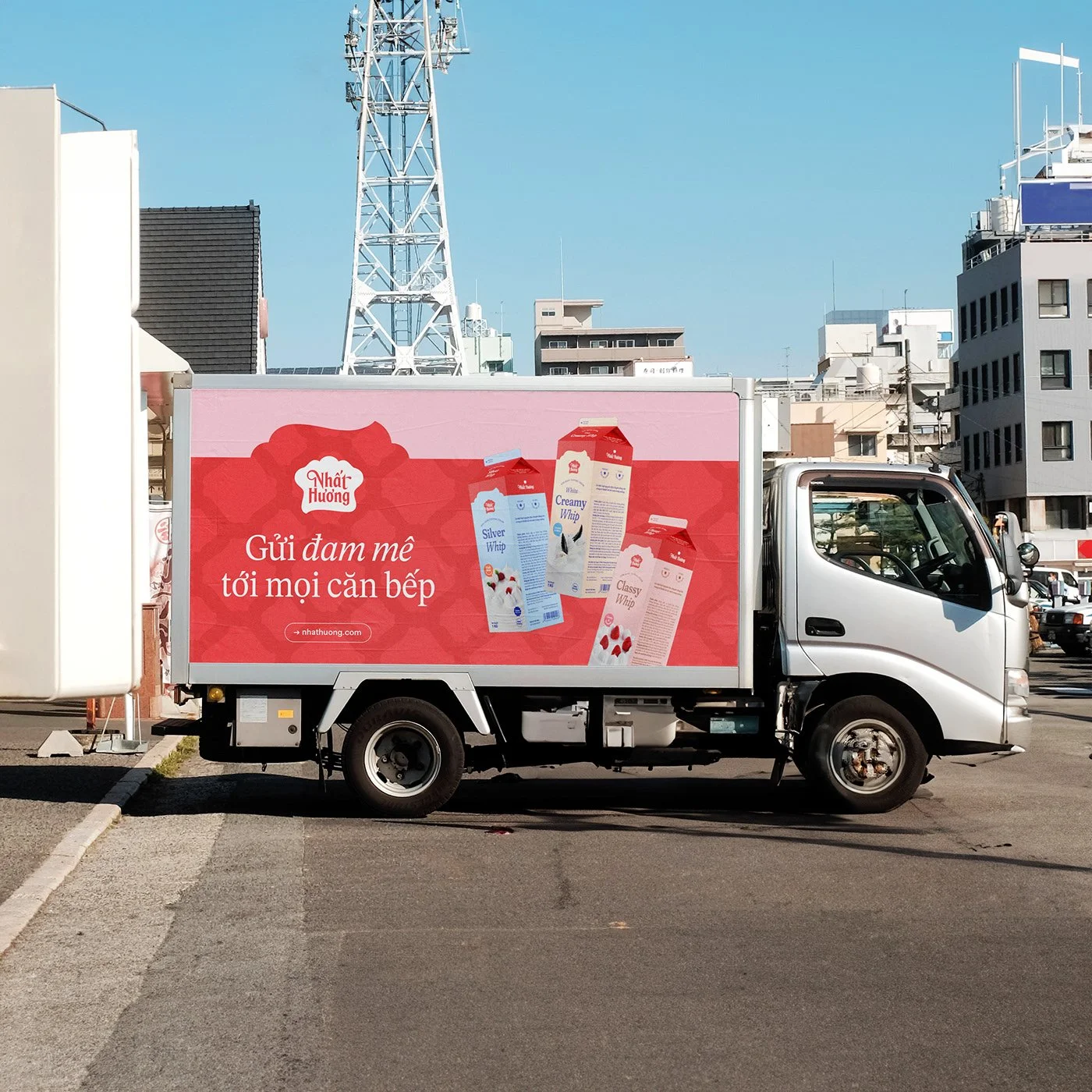
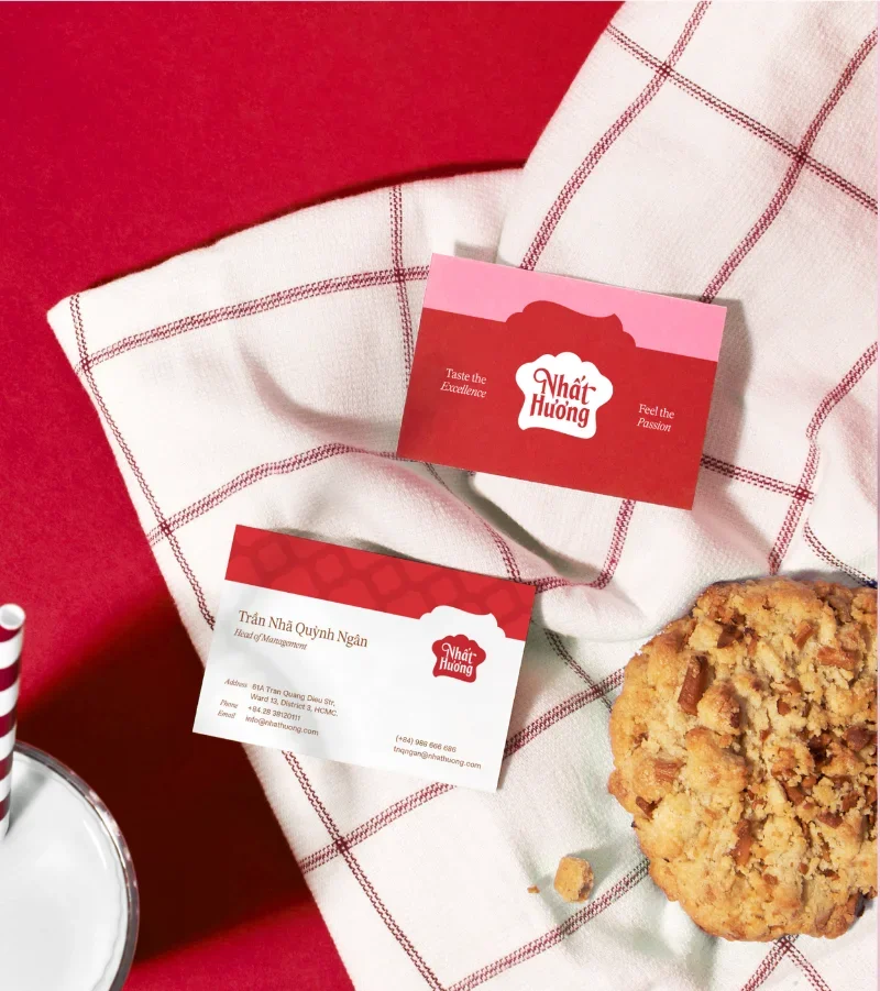
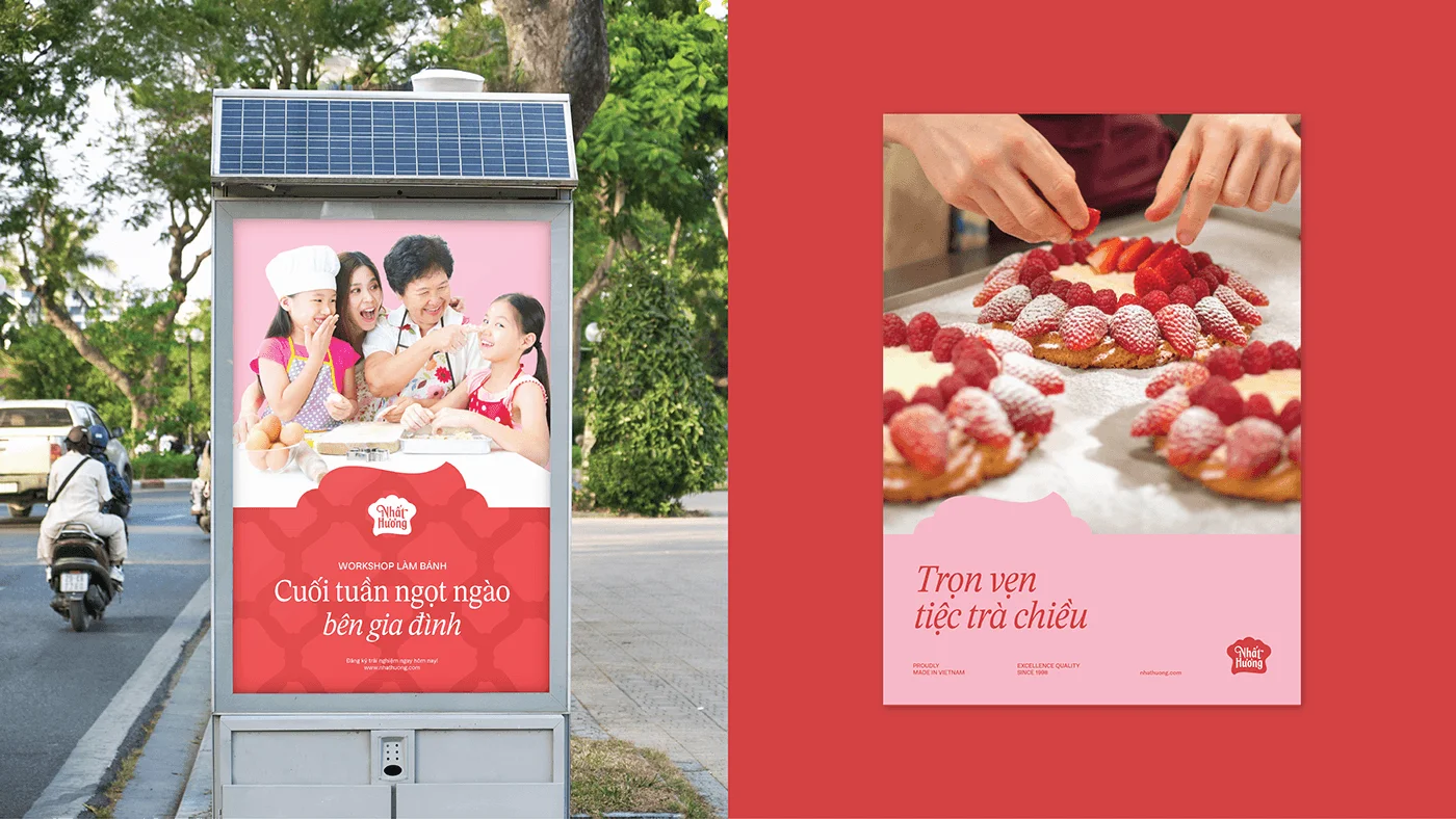
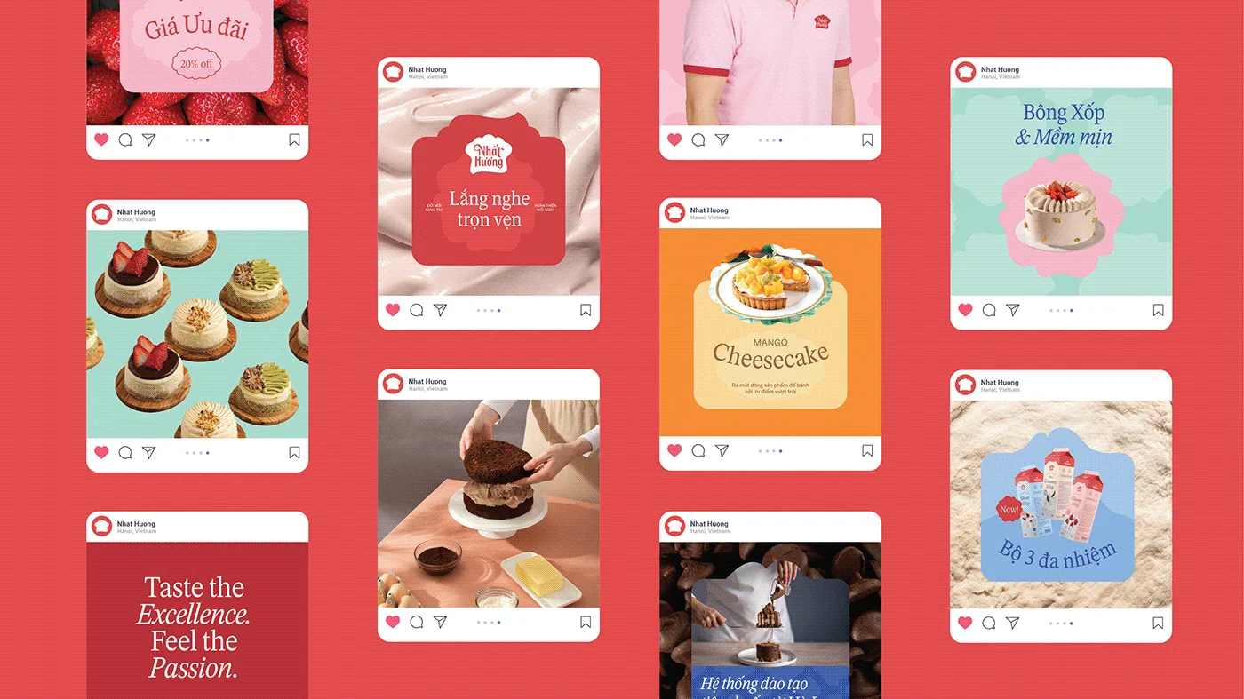
The team extended the system to bags, vehicles, stationery, and campaigns. I contributed to photography direction and the out-of-home and social systems:
Shopping bagVehicle wrap
StationeryOut-of-homeSocial
SYSTEM DELIVERABLES
The finished boards include:
Identity: refreshed mark + wordmark, 2 seal variants (Proudly Made in Vietnam · quality/est. seal), 3 lockup treatments (pink, red, black)
Packaging: cartons, tubs, squeeze bottles, frozen trays; bilingual label system with seals, usage icons, and barcodes
Applications: bag, fleet livery, cards, signage, OOH posters, social grid system
WHERE IT LANDED
The client approved the full system at final review. The creamer line entered production first, and I’ve seen the refreshed cartons on shelves in Ho Chi Minh City.