Hey Period: brand, site and app for a new health test
Hey Period was developing a blood test that uses menstrual blood. During a two-month project in 2022, I interviewed 52 women, designed the brand and app UI, and designed and built the landing page from scratch. The landing page went live.
Project details
CLIENTHey Period · femtech startup
ROLEProduct designer & researcher · only designer
TIMELINE2 months · 2022
TOOLSFigma · HTML · CSS · JavaScript
My scopeBrand, website and assets; marketing copy with the Head of Product.
Built on team workApp UI and navigation built on the team’s low-fidelity flows.
Waitlist resultRoughly 1,800 signups in the first three months.
The landing page launched during R&D. App screens are from the 2022 design handoff.
EXPLAIN THE SERVICE, THEN THE NEXT STEP
Before asking women to trust an unfamiliar test, the design had to explain what the proposed test could tell them and how collection would work.
FROM TEAM FLOWS TO APP SCREENS
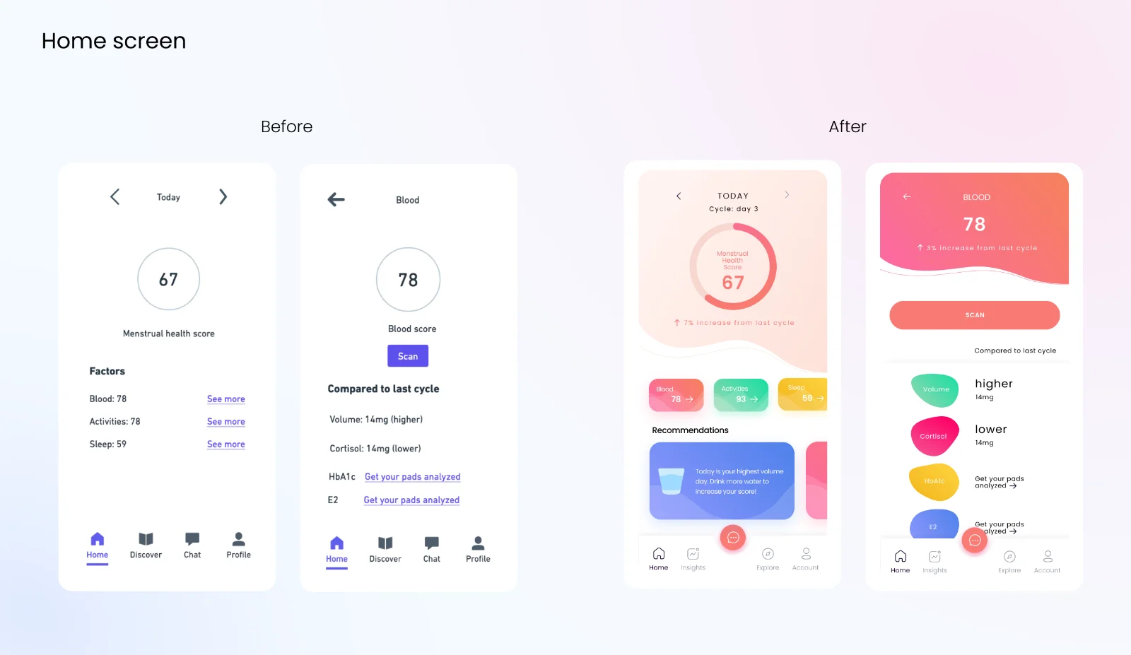
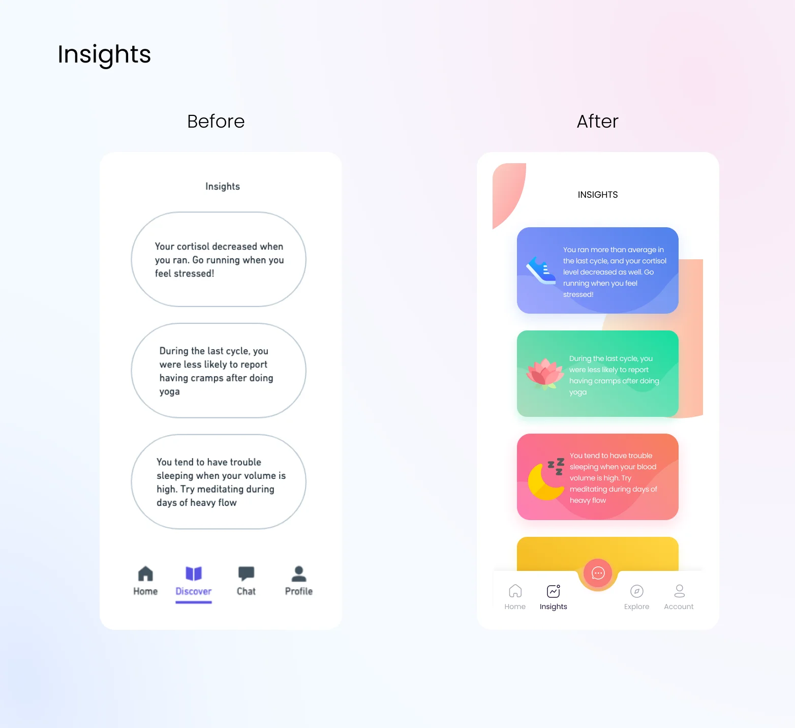
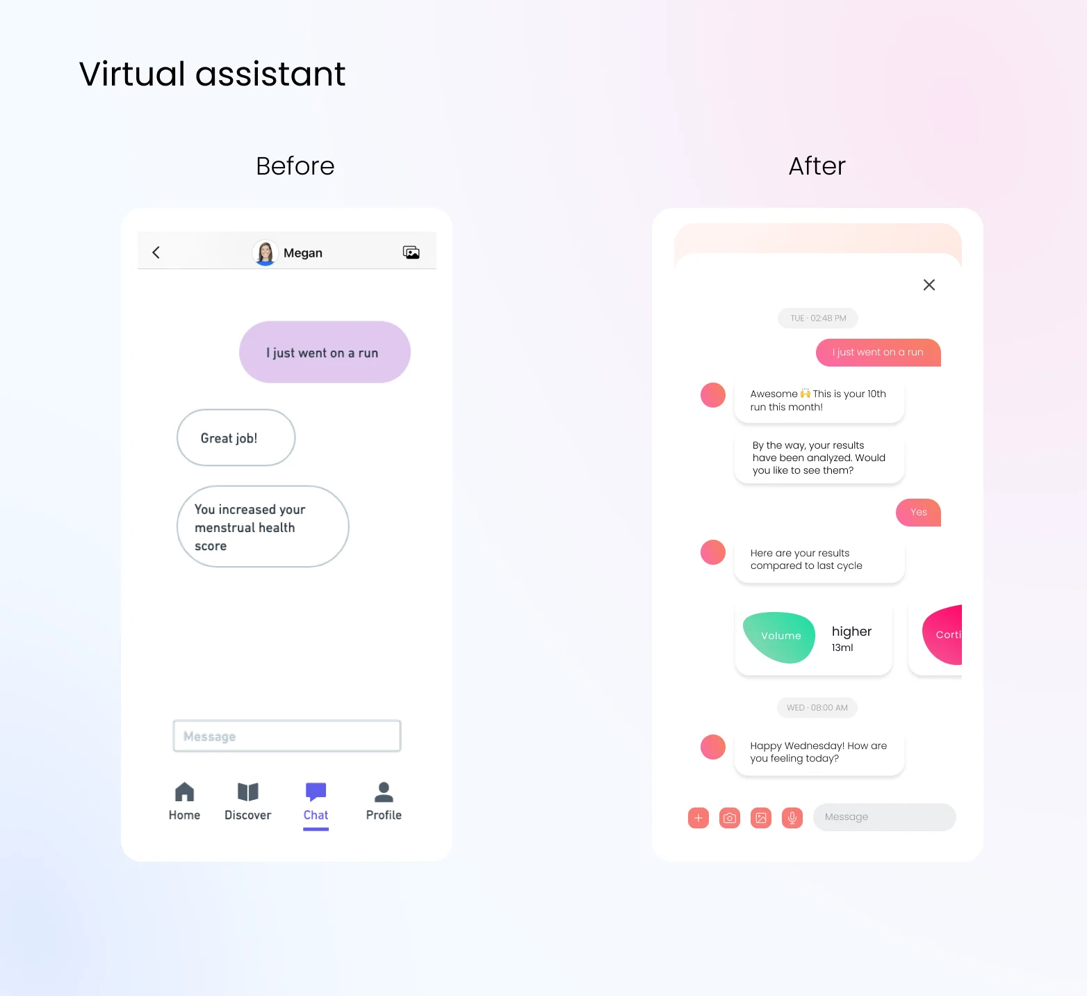
I turned the supplied flows into a consistent interface, making Insights a destination and moving the assistant to a floating entry point.
Team wireframe → my Home UIInsights, 2022 handoffAssistant, 2022 handoff
52 INTERVIEWS WITH WOMEN
I interviewed 52 women aged 19–44, recruited through the waitlist, two women’s-health communities and referrals. Most were 20–30-minute video calls; about a dozen were shorter conversations at a campus health fair.
From kickoff through handoff, I took notes and reviewed themes weekly with the Head of Product. We covered cycle tracking, symptoms, menstrual blood versus a conventional draw, and trust. Of the 52 women, 38 used tracking apps, mostly for prediction.
What I heard
What it meant for the design
21 women questioned what menstrual blood could reveal versus a conventional test. Credibility outweighed discomfort with collection.
I named proposed biomarkers, including AMH, TSH and hs-CRP, and explained collection before signup.
Period apps could feel warm but shallow; lab services could feel impersonal.
I paired familiar pink with a structured information hierarchy.
14 women raised privacy concerns unprompted, particularly sharing with insurers or advertisers.
These concerns required clear answers about data use and sharing; visual reassurance alone could not address them.
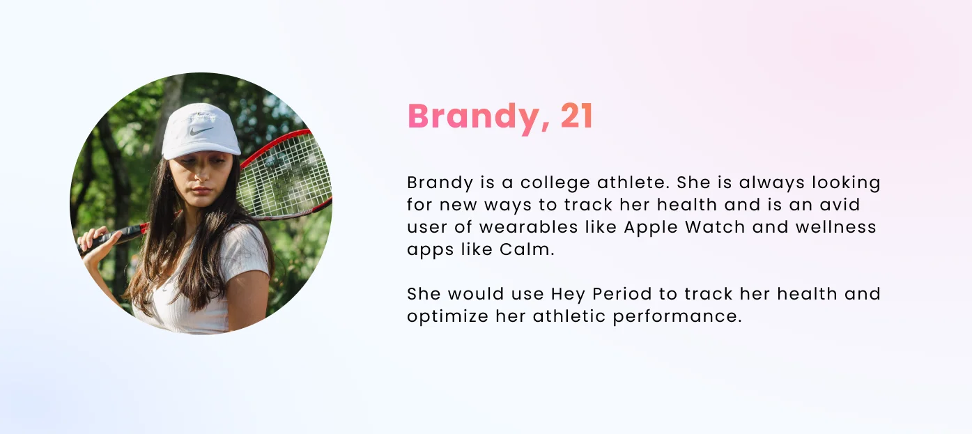
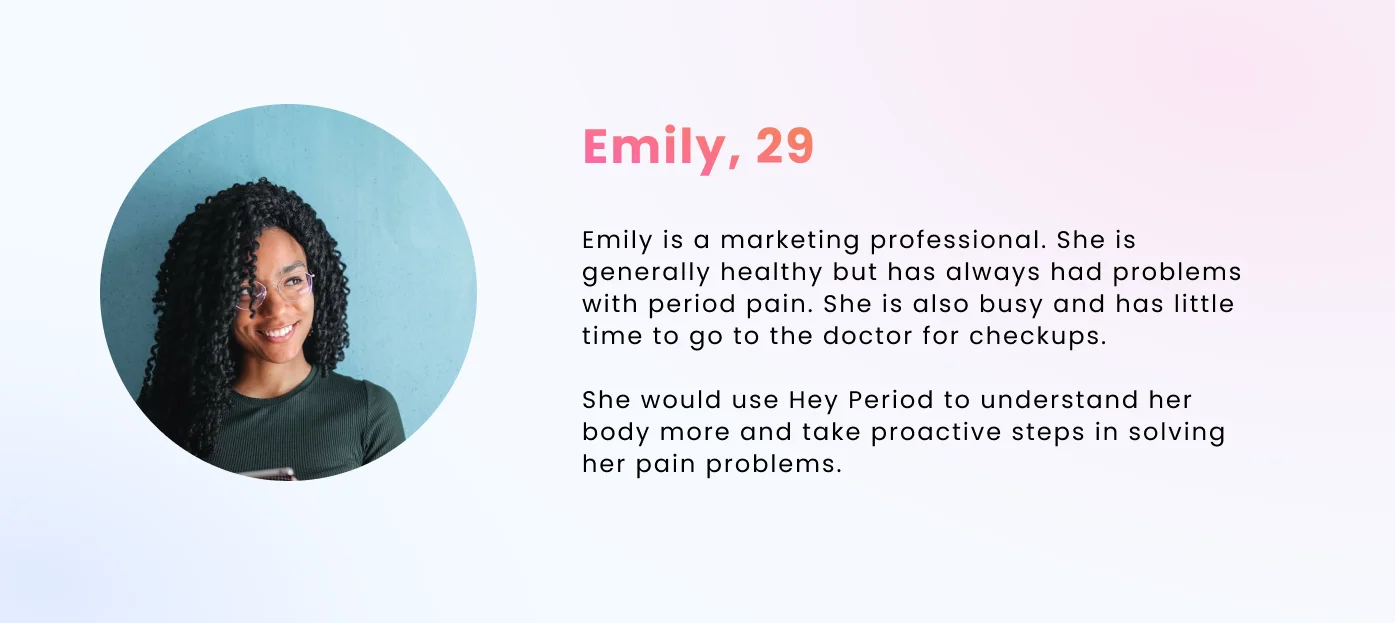
Brandy represents people seeking health optimization; Emily represents women looking for answers to symptoms. Both are composite personas, with statements paraphrased from recurring interview themes.
Brandy: composite personaEmily: composite persona
HOW PLAYFUL COULD A BLOOD TEST FEEL?
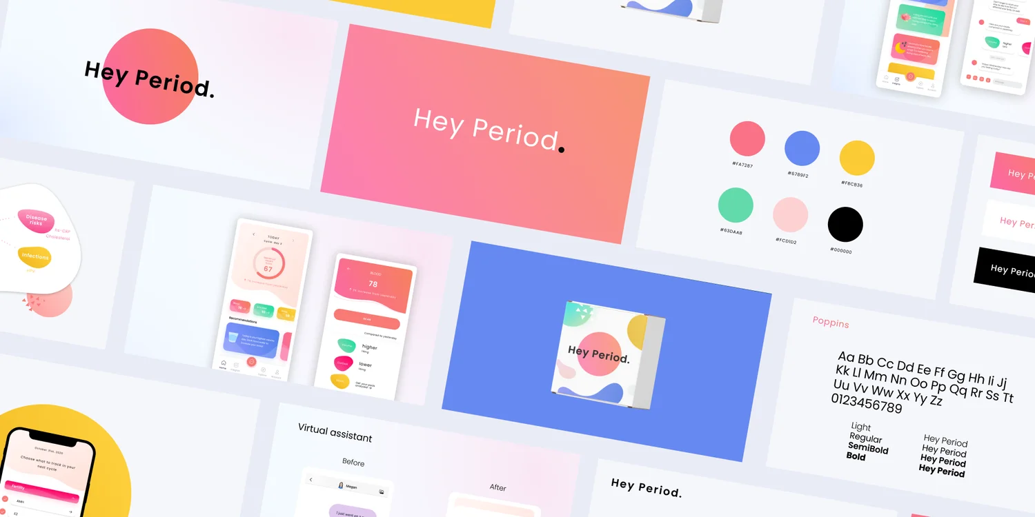
I wanted the identity to feel approachable while taking the test seriously.
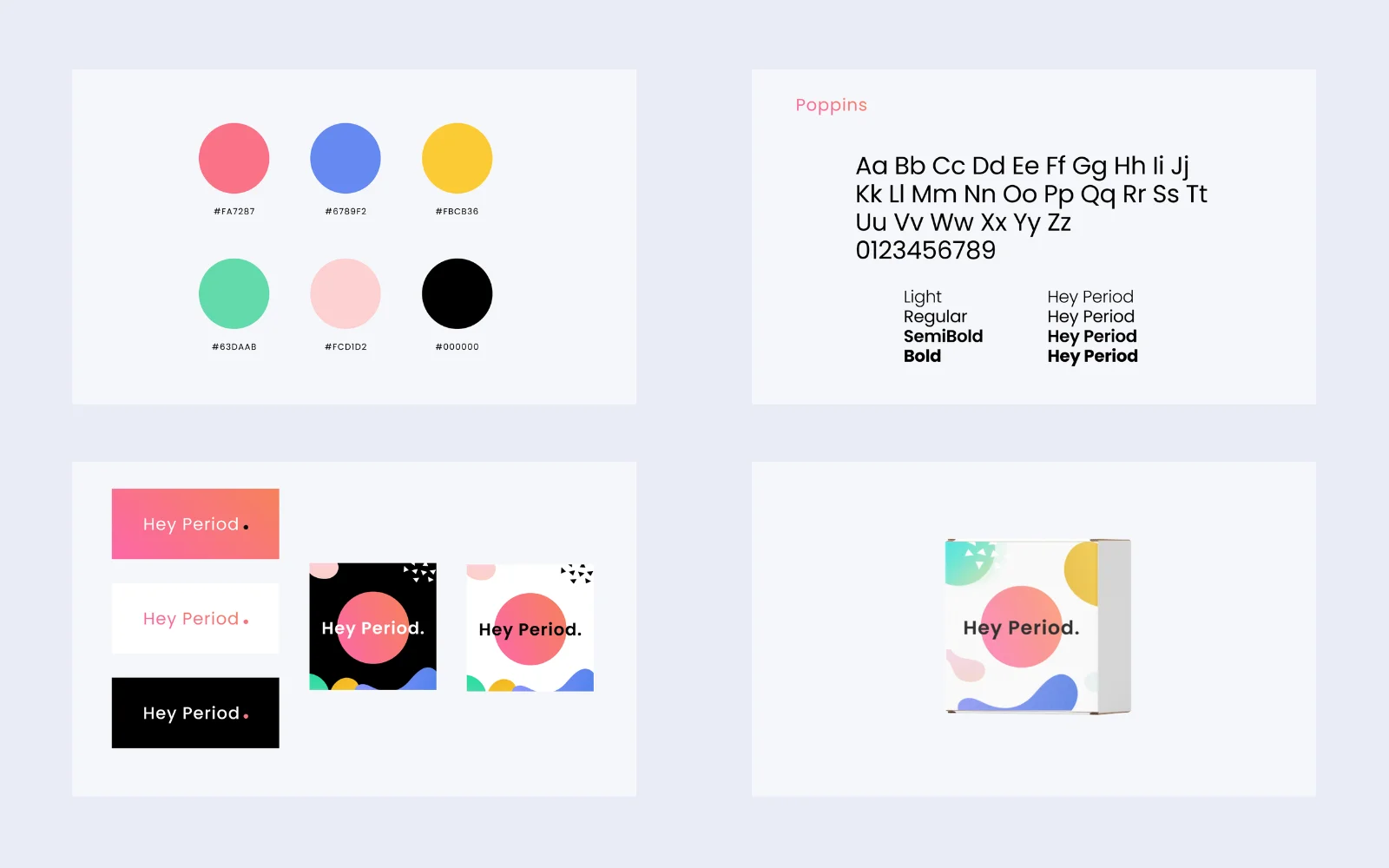
A familiar starting point.
Pink connects to period care; geometric shapes keep the identity flexible.
Color across the system.
Periwinkle, marigold, mint and blush carry through packaging and app categories.
Poppins, for both jobs.
Poppins could handle both interface labels and larger brand typography. Using one family across the website and app also kept the two-month scope manageable.
Brand system
ONE JOB: EXPLAIN IT AND GET A SIGNUP
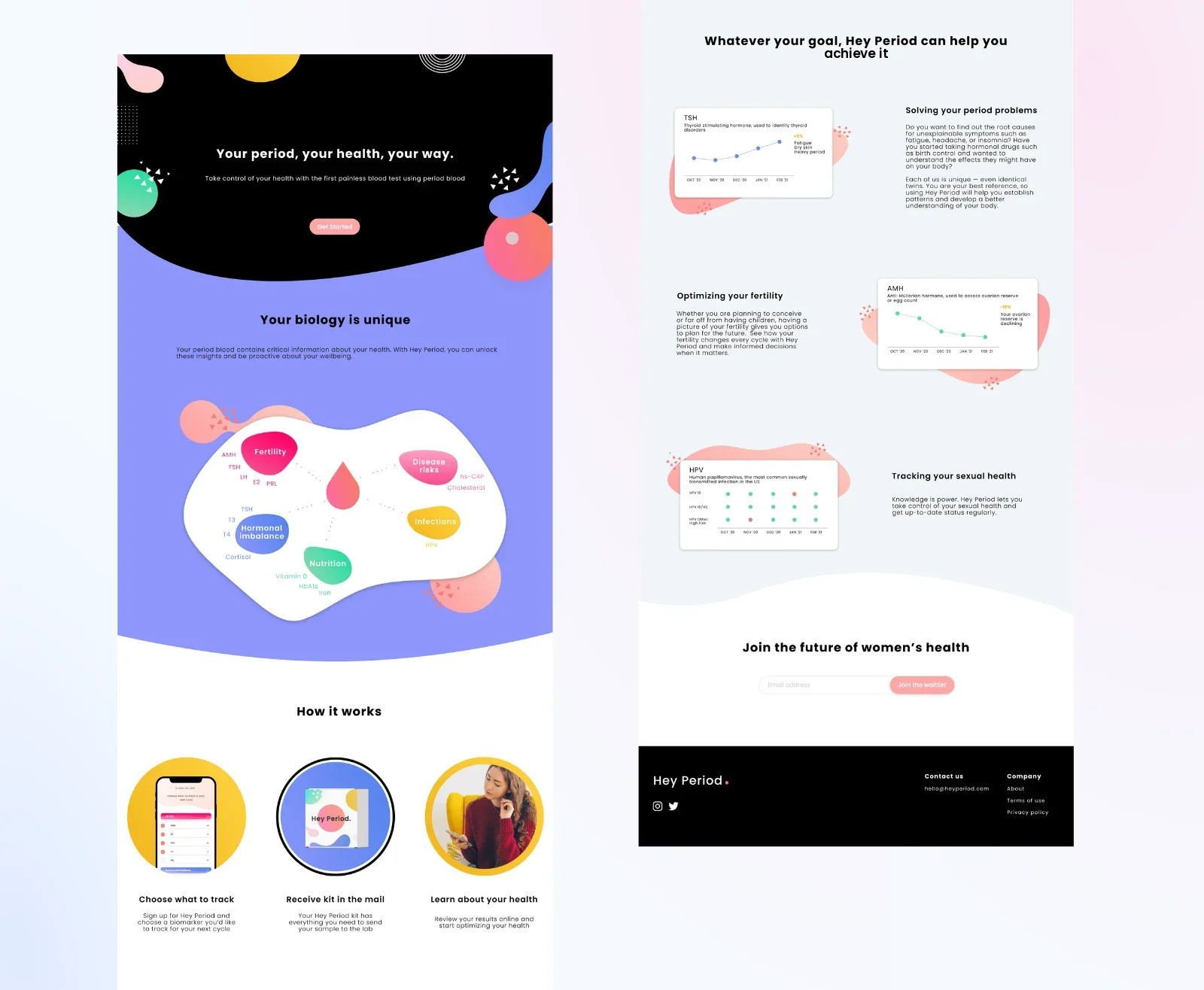
The landing page explains the service and collection process before asking for an email, and launched as the project’s waitlist page.
Group the proposed biomarkers
Grouping proposed biomarkers by topic makes the explanation easier to scan.
Start with visitors’ questions
Period concerns, fertility and sexual health organize the page around visitors’ questions.
Explain the collection process
Three steps explain choosing a test, receiving the kit and getting results.
Launched landing page
THE LANDING PAGE WENT LIVE
Roughly 1,800 people signed up in the first three months, mostly through the two community channels. The waitlist captured early interest in the proposed service.
My engagement ended with the app handoff while R&D continued.
REVISITING THE HANDOFF
In 2026, I revisited the 2022 handoff. I changed pale cards to dark text and explicitly labeled the automated assistant. I also replaced the original biomarker interpretations with neutral journal entries in this later screen, so it shows a content change as well as a visual revision.
Contrast. White text on pale chips and cards needed a darker treatment across labels and body copy.
E2SleepActivitiesBlood
2026 color revision
hey period.
Insights
A look at your journal. Example entries · not health analysis
Activities
You added three activity entries this week.
From your journal · example
Blood
Your latest journal entry is saved with this week’s notes.
From your journal · example
Sleep
Your sleep notes appear together, ready to revisit.
From your journal · example
Automated assistantOpen a conversation→
HomeInsightsExploreAccount
2026 revision: darker text, an automated-assistant label, and example journal content. Original 2022 client screens appear above.Contrast measurements
Contrast values for four sampled backgrounds:
Chip (sampled color)
White text
Dark text (#1A1A1A)
Fix
Sleep marigold rgb(247,204,78)
1.53 (fail)
11.36 (pass)
flip to dark text
Activities mint rgb(105,226,183)
1.60 (fail)
10.91 (pass)
flip to dark text
Blood coral rgb(253,138,147)
2.27 (fail)
7.65 (pass)
flip to dark text
E2 periwinkle rgb(140,166,255)
2.33 (fail)
7.47 (pass)
flip to dark text
WHERE IT LANDED
The interviews shaped the explanation as much as the identity. The landing page went live while R&D continued. I also delivered the brand and app UI.
Research52 interviews I conducted with women
Waitlistroughly 1,800 signups in three months
Landing pagedesigned and built from scratch · launched
App UIvisual system + nav restructure over the team's lo-fi