A reusable-cup rewards app designed with a four-person team. I co-wrote the survey, moderated two wireframe sessions, and created the persona, brand identity, and all illustrations.
Project details
ROLEProduct designer
TEAM4 people · class project
TIMELINE3 months (one semester) · 2022
TOOLSFigma · Whimsical · Qualtrics
What it isRewards for bringing a reusable mug to local cafés. No purchase-gated cup: any mug counts.
My partResearch, persona, brand identity, and all illustrations. We shared the app flows, wireframes, final screens, and animations.
Team research60 survey respondents · 5 wireframe sessions
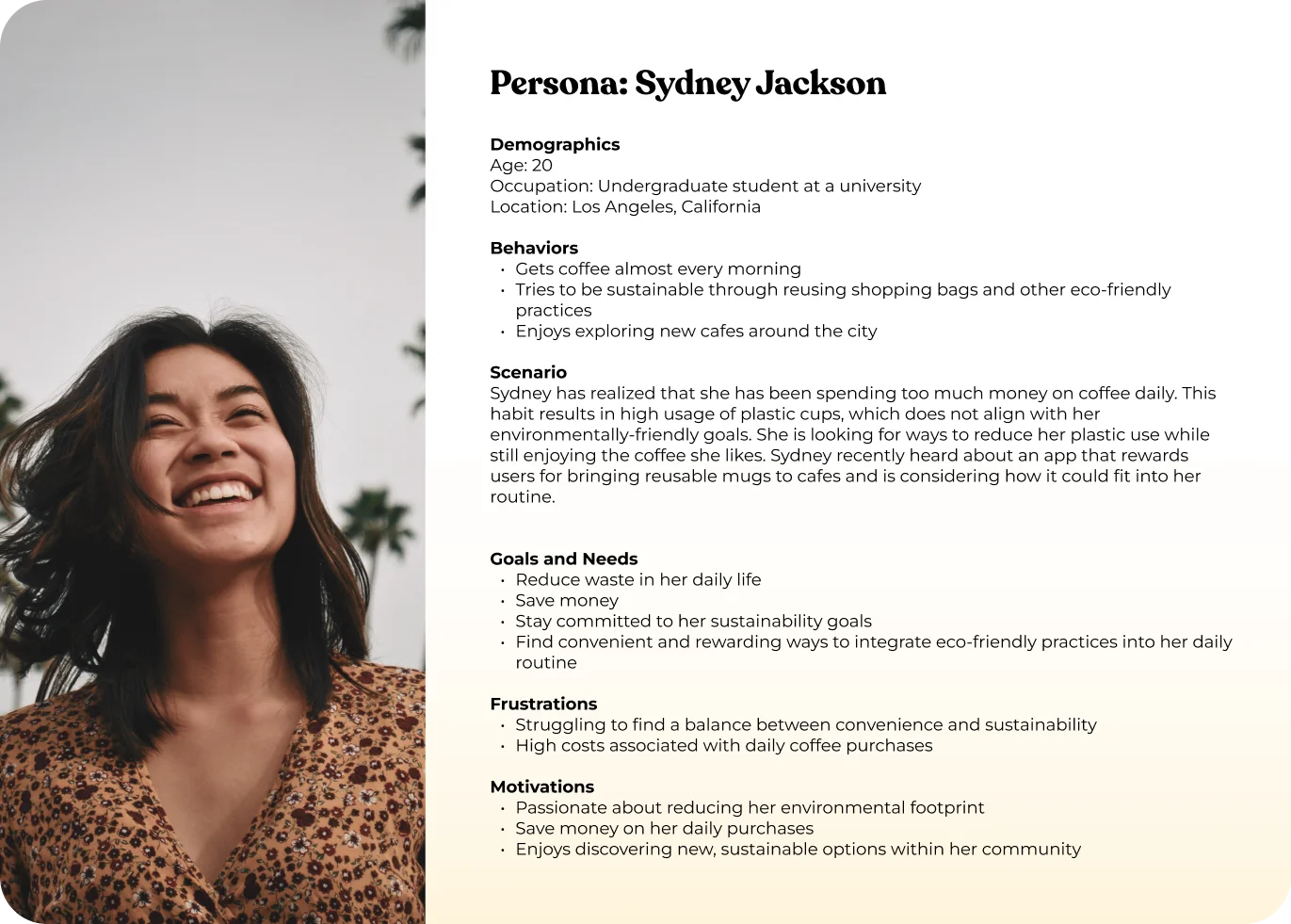
I co-wrote the Qualtrics survey with one teammate and moderated two of our five wireframe sessions. The survey reached 60 college students who did not use reusable cups; I synthesized the survey and session notes into Sydney.
DESIGNING AROUND A COFFEE ROUTINE
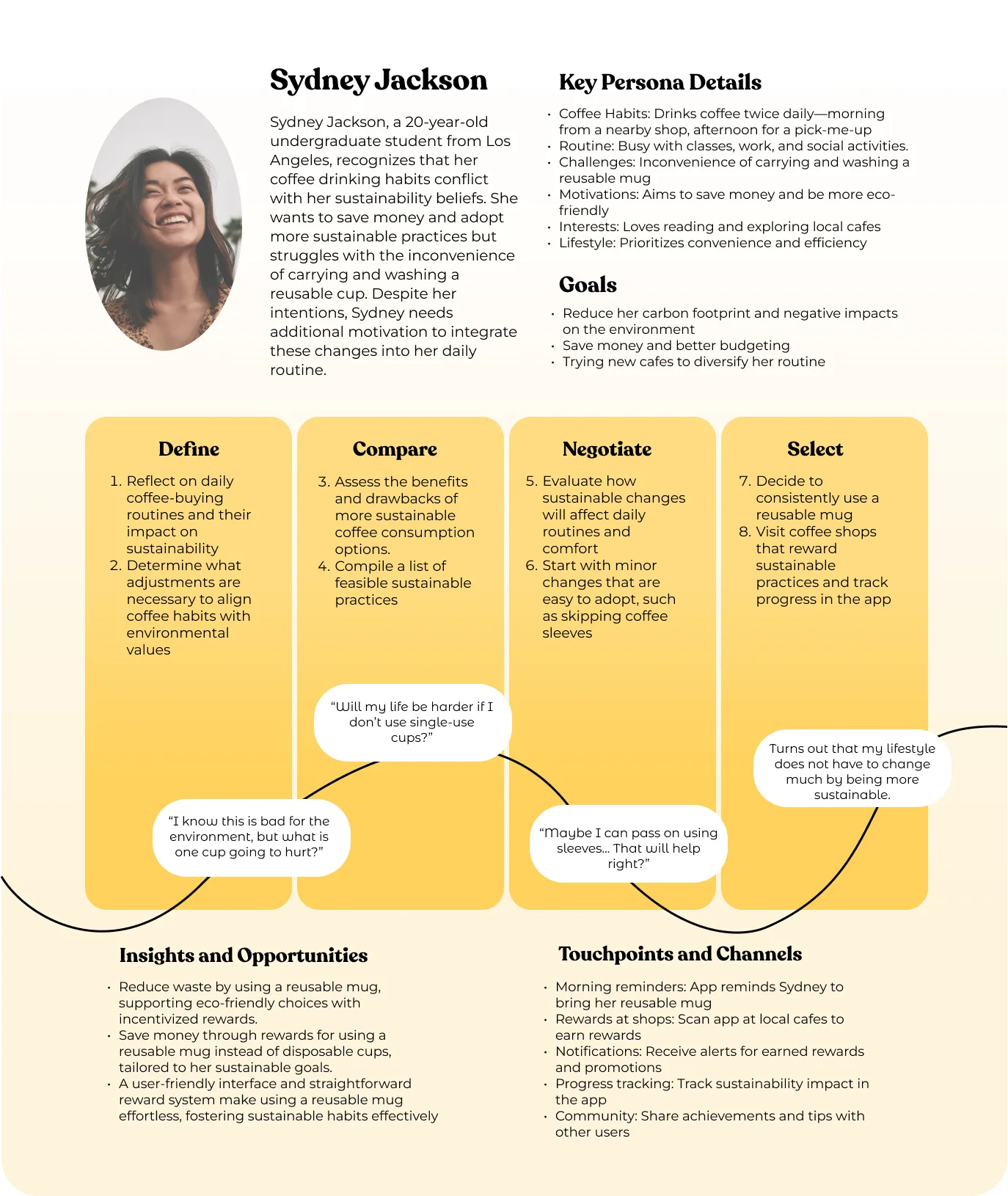
The survey’s leading barriers were forgetting a cup, seeing little reason to bring one, and being short on time. I brought those concerns together in Sydney, a student buying coffee between commitments.
Sydney: my research synthesis
WHY PEOPLE SKIP THE REUSABLE CUPSURVEY FINDINGS
Memory
FORGET TO BRING ONE
Value
SEE NO REASON TO
Time
DON'T HAVE TIME
These were the leading barriers in the survey. We used them to focus the design on remembering a cup and making the reward easy to understand.
CONNECTING THE STEPS
The design explores a small habit: remember a cup, use it at a café, and see a reward.
WHAT THE WALKTHROUGHS SHOWED
In the wireframe sessions, all five participants responded more strongly to rewards than to sustainability messaging. Two said waste reduction did not matter to them.
“How might we make being sustainable the convenient choice, not the extra chore?”
THE HMW THAT GUIDED THE DESIGN
JOURNEY
The journey map connects those concerns to moments where the app could help: remembering a cup, checking progress, and using a reward at the café.
Team journey map
REWARDS FOR REUSING A CUP
Mug makes any reusable cup eligible. The team explored six features around progress, rewards, and local cafés:
Accounts tracking every cup saved, over time and per café
A feed where friends see and nudge each other's savings
Saved payment for faster ordering and instant discounts
Custom avatars: a mug made yours
A payment barcode one tap from Home
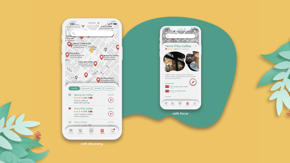
Nearby cafés and their available rewards
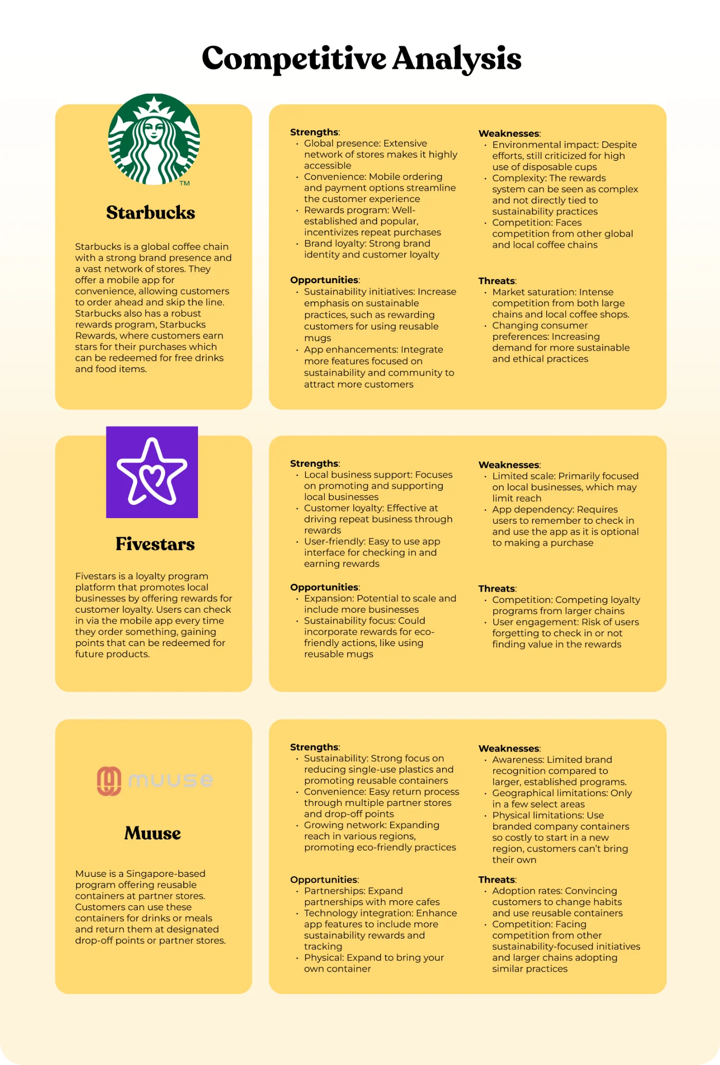
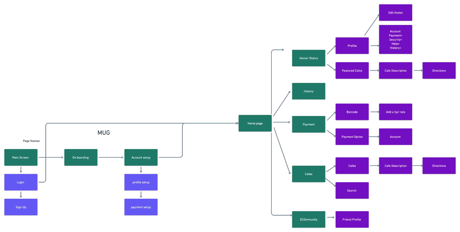
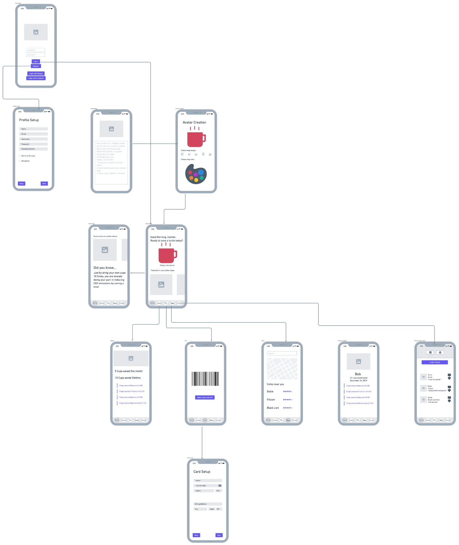
Competitive references, 2022Sitemap and flowTeam wireframes. The tree-saving figure is illustrative.
MAKE CHECKOUT CLEARER
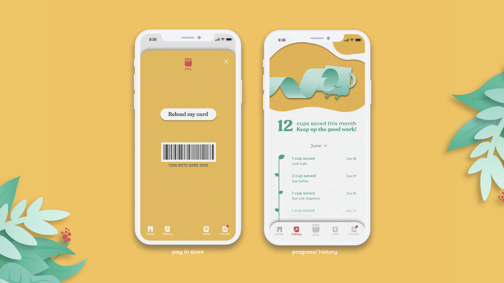
Four of five participants were unsure whether the cup was verified before or after ordering. We brought barcode access closer to the checkout moment: in the illustrated flow, Pay opens it one tap from Home.
Next change: remove the separate reload.
Two participants felt that reloading a balance was like managing another gift card. We decided to remove that step; the saved prototype below shows the earlier flow.
Keep referrals in the backlog.
One participant suggested referrals without prompting. We recorded the idea without adding it to the current flow.
BRAND
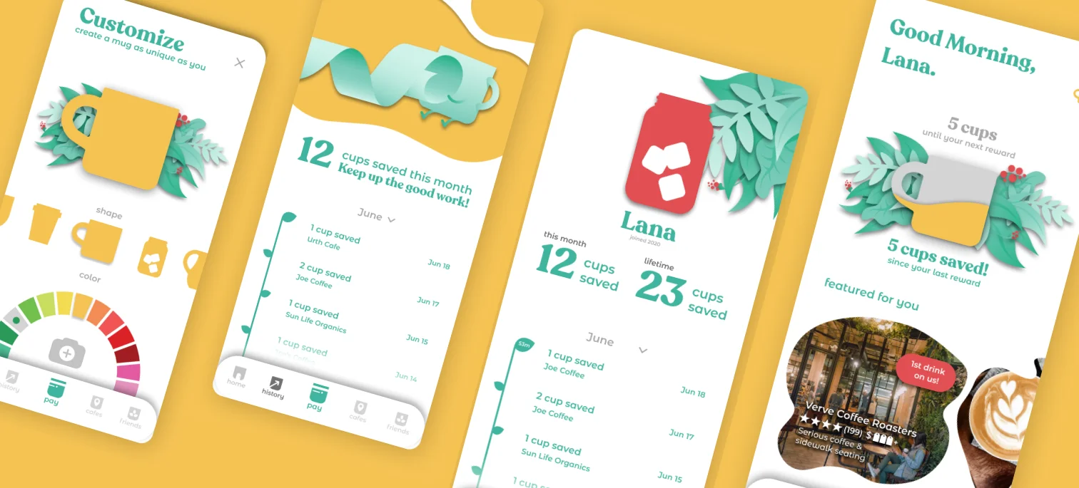
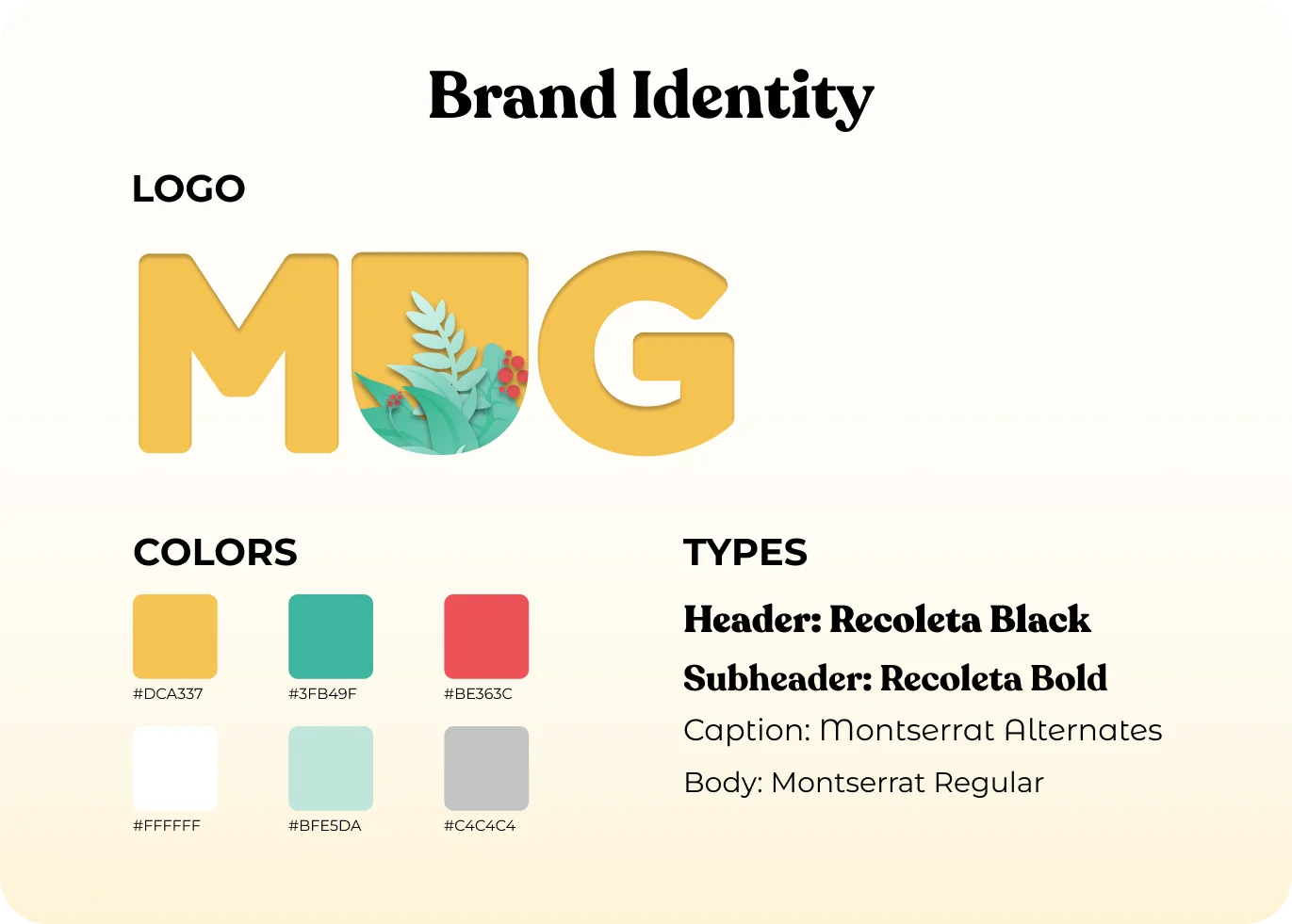
I wanted Mug to feel at home in a neighborhood café. Warm yellow gives the screens their shared backdrop; green connects the cup and leaf motif; red adds emphasis to favorites, map pins, and social actions. Recoleta gives the headings a rounded, friendly shape, while Montserrat separates the smaller interface text.
My identity and illustrations, applied by the team
THE TEAM PROTOTYPEPROTOTYPE, IN MOTION
01
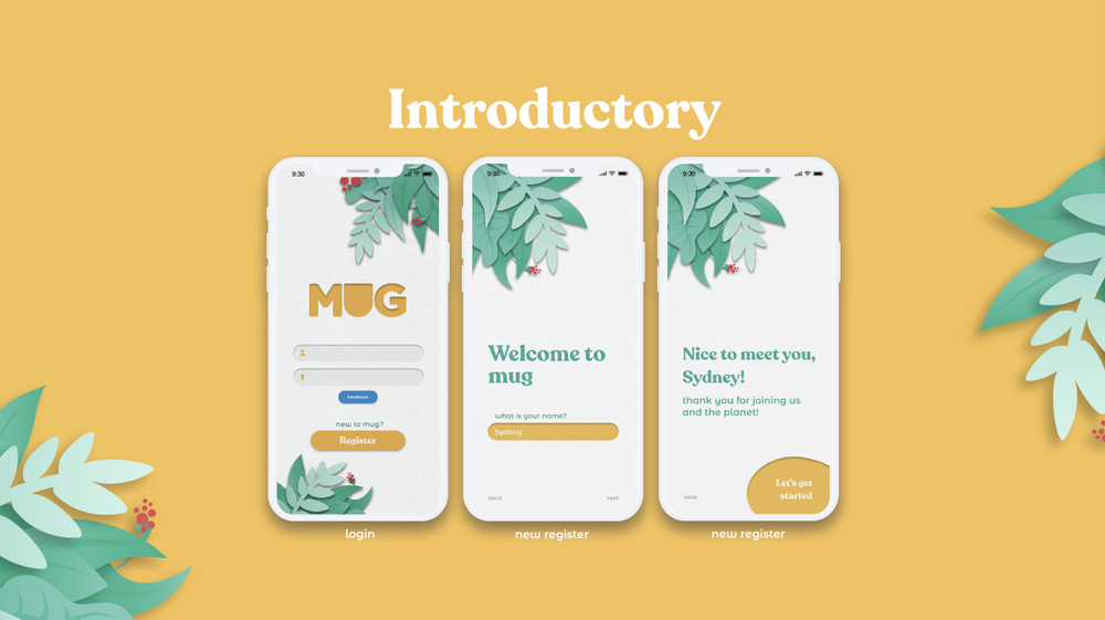
Sign up, then straight in
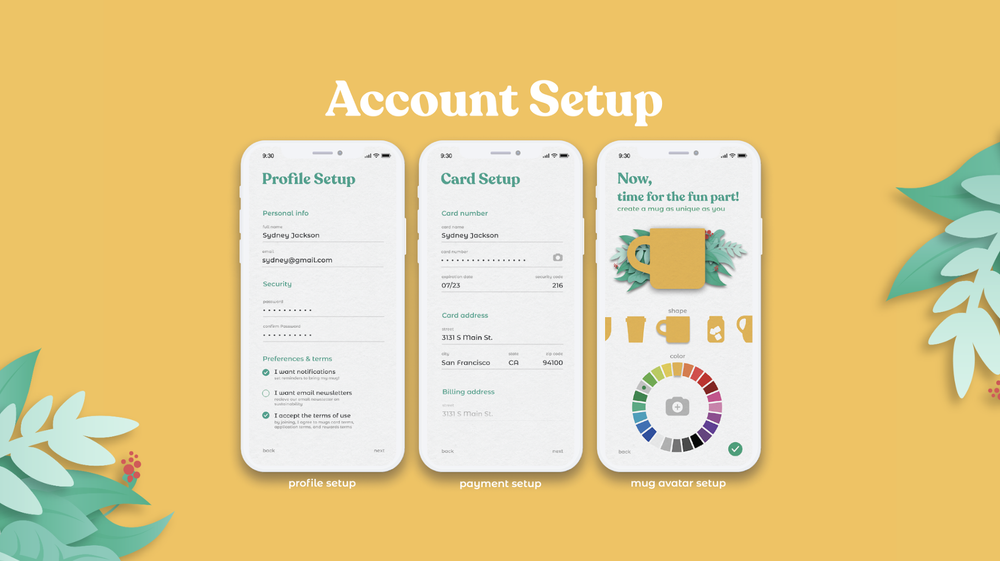
Social sign-in or a quick account, customize your mug, and you're in.
02
Home, payment, and cafés
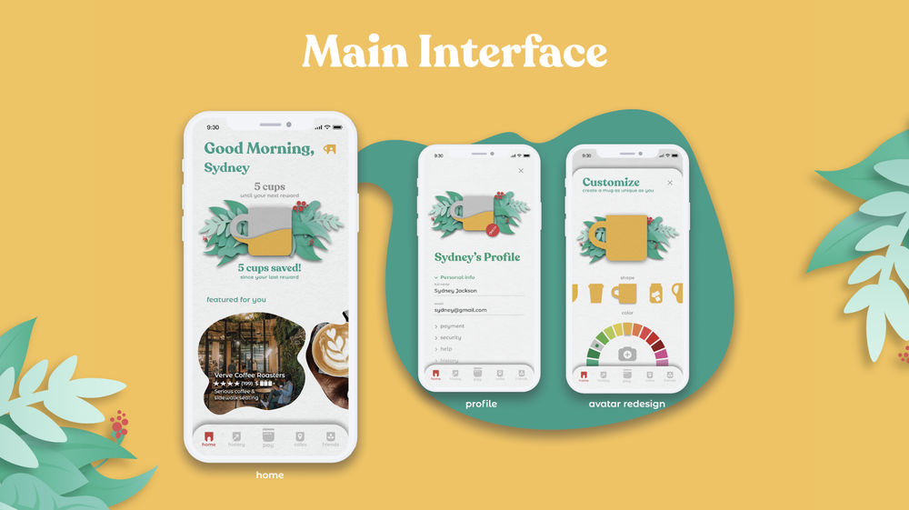
The home screen leads to a barcode payment sheet and a map of nearby cafés.
03
ECOmmunity
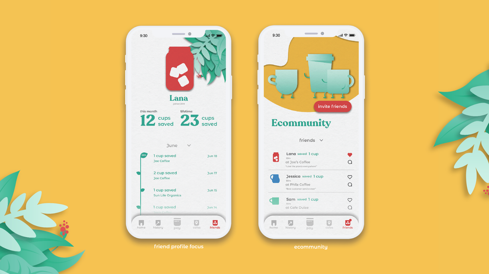
The community feed and profile show friends’ activity and a history of cups saved.
View the team screen gallery
The gallery shows the team’s UI using my identity and illustrations.
HIGH-FIDELITY SCREENSFIGMA
A CAFÉ PILOT
The wireframe sessions clarified the customer flow. A café pilot would build on that work:
Verification. Test how staff record a reusable cup alongside the account barcode.
Rewards. Agree with cafés on how rewards are funded and settled.
Use over time. Observe checkout in cafés and whether rewards encourage people to keep bringing a cup.
WHERE IT LANDED
The research made the checkout problem more specific. People needed a reason to bring a cup, a clear way to use it, and confidence about when it counted. I brought those needs into the persona and gave the team a visual identity and illustration system to build on.
Project2022 · team collaboration
My contributionresearch, persona, identity, all illustrations
Any mug countsany reusable cup; no branded cup required