Lana Nguyen. OPEN TO NEW ROLES →
← WORK / № 06 · CLIENT

Matrix — build-ready UI at startup speed

Matrix connects fans with creators through rewards and gamified engagement. Working directly with the CEO, I turned specs and the brand's existing style guide into eleven hi-fi screens for a waiting dev team, across two feature areas, in one week.

CLIENTMatrix · startup
ROLEUI designer · solo
TIMELINE1 week · 2021
TOOLSFigma
The briefSomeone else's spec, someone else's style guide (dark surfaces, neon accents), two feature areas: events & voting and tokens & NFTs. Lo-fi → team review → pixel-final, twice over.
My partAll of the design, wireframes through hi-fi, reviewed by the CEO and team. Screens use fictional creators and sample data.
StatusHanded off [ADD: what the dev team built / shipped, or that the trail ends at handoff]

HOW TO READ THIS PAGE — artifacts carry disclosure labels: MEASURED real, checkable data · RETROSPECTIVE made after the project to document reasoning · PROPOSED a goal or plan, never an achieved result.

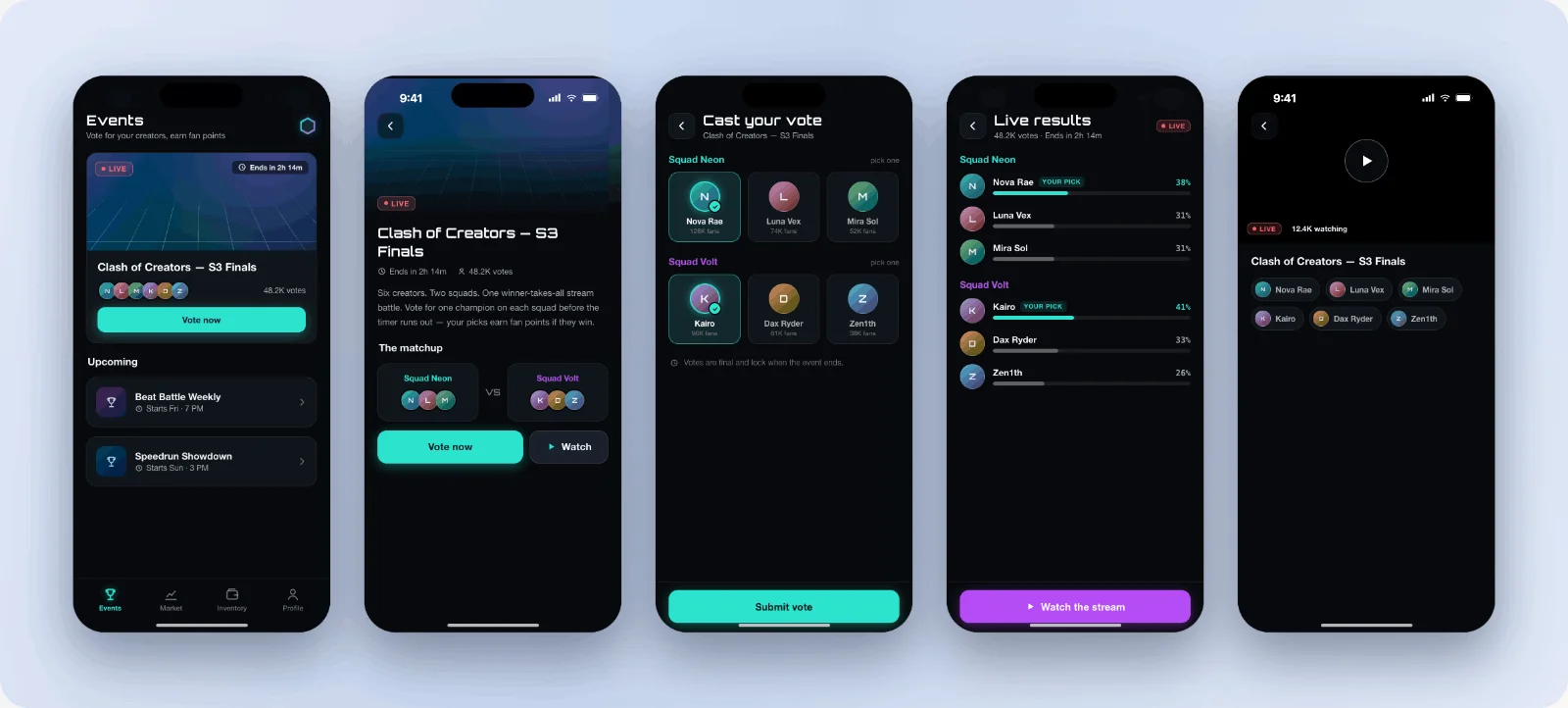
Matrix hi-fi screens: events list, Clash of Creators event detail, cast your vote, live results, and the stream view
THE ENGAGEMENTSPEC → HANDOFF
1 wk
FROM SPECS TO DEV HANDOFF
2
FEATURE AREAS
11
HI-FI SCREENS DELIVERED
OVERVIEW

Unlike my zero-to-one projects, Matrix was disciplined execution: a fixed spec, a fixed style guide, a dev team waiting. The interesting work sat in the gap between the spec and what would be pleasant to use, clearest in the voting flow below.

FEATURE 01
EVENTS & VOTING

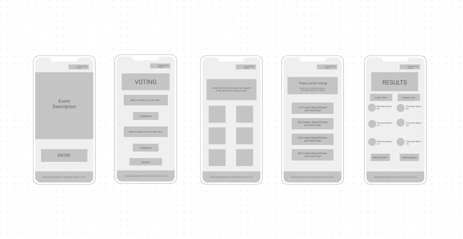
Fans browse live events and vote for creators. I drew lo-fis from the spec, reviewed them with the CEO and team, then went hi-fi:

Low-fidelity wireframes: event description, voting flow with champion dropdowns, creator selection, vote confirmation, and results, annotated with spec notes
Lo-fiStraight from the spec: dropdown champion pickers, plus annotations for a nav swap and EN/VN language toggle.
Hi-fi screens: events list, Clash of Creators event detail, cast your vote with tappable creator cards, live results, and the stream view
The decision that mattersThe spec's dropdown champion pickers became tappable creator cards with fan counts: voting should feel like picking a fighter, not filling in a form. It survived CEO review into the handoff.

Two annotated spec behaviors, the navbar swapping Market for Tournament during live events and a per-screen language toggle, didn't make this hi-fi pass. [ADD: why — deferred by the team? picked up in a later sprint? Honest deferral reads better than the boards contradicting the copy]

FEATURE 02
TOKENS & NFTS

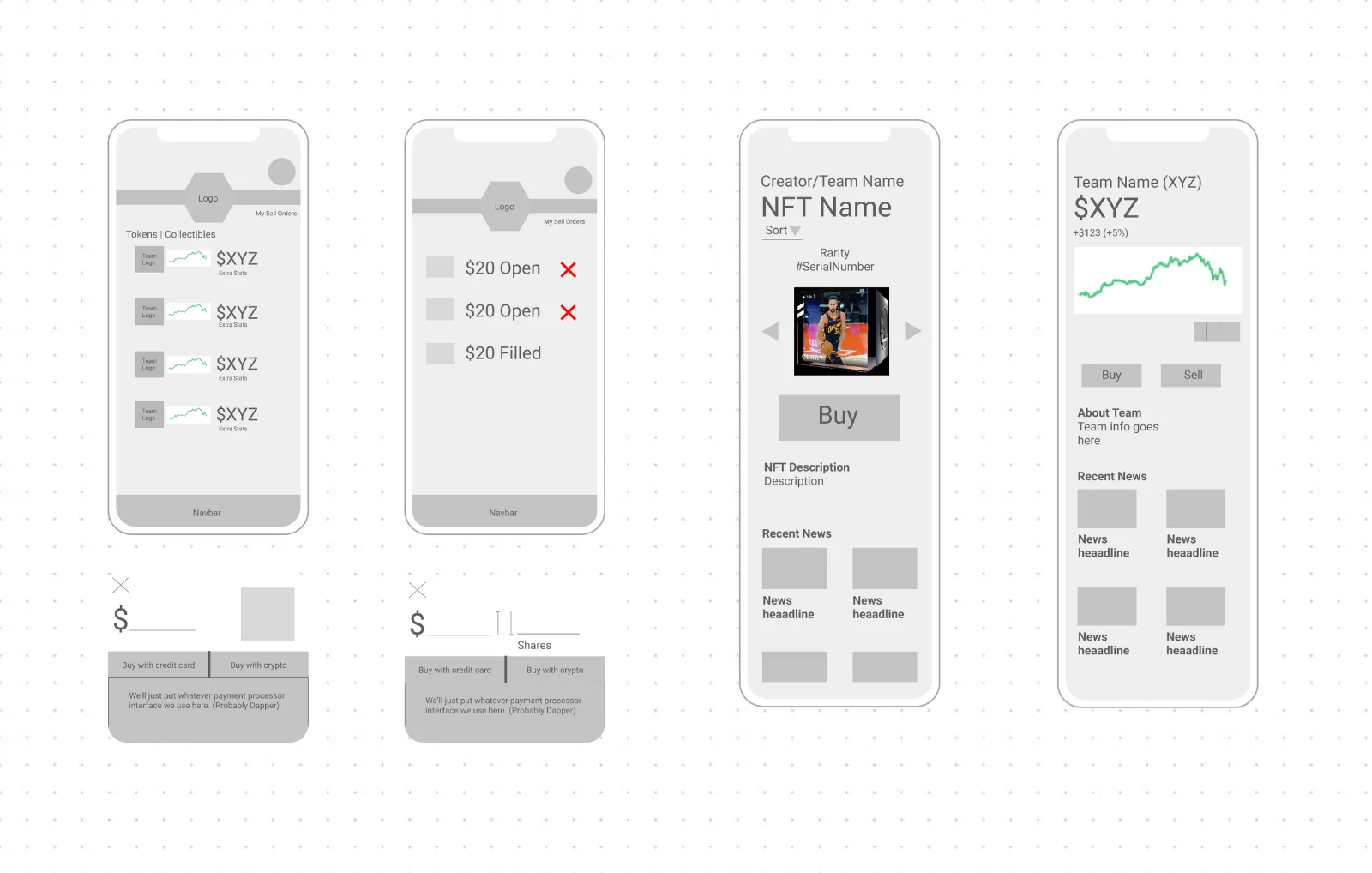
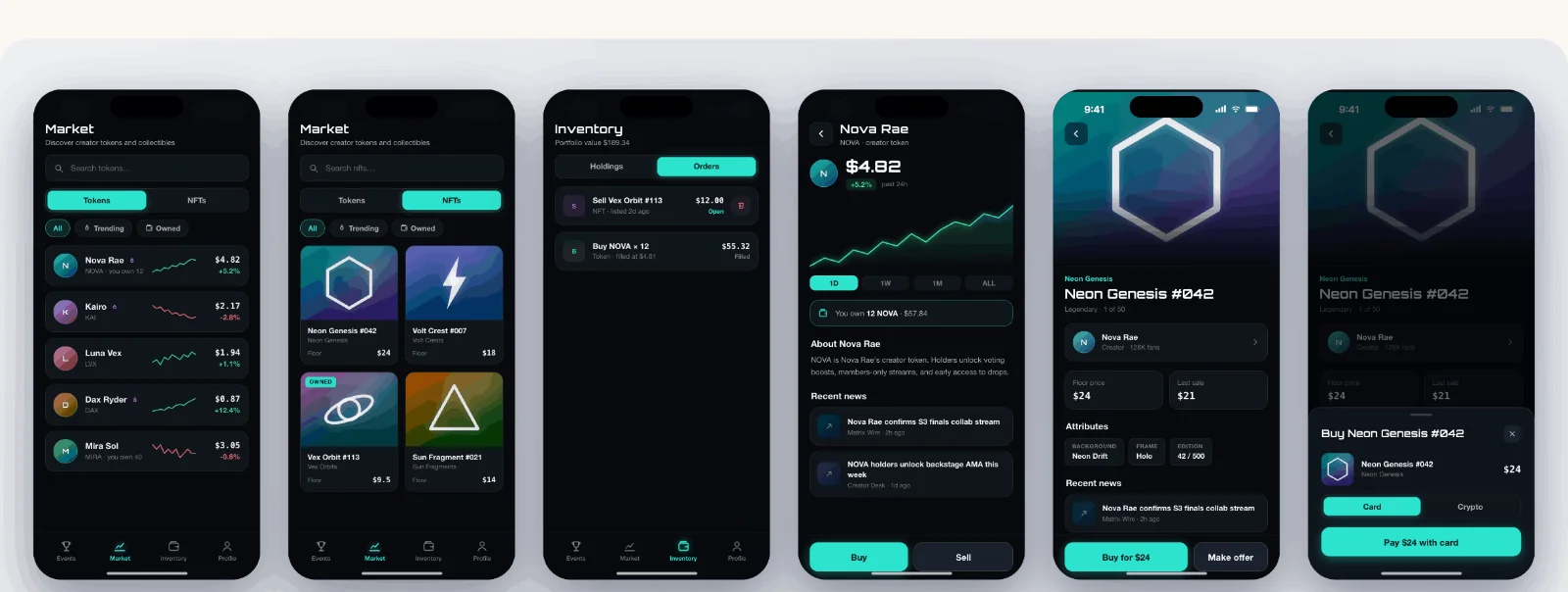
Fans buy and sell creator tokens and collectibles, same lo-fi-to-hi-fi rhythm.

  • Market: prices and trading for tokens and collectibles
  • Orders: filled and open in one list, one-tap cancel for open ones
  • Detail pages: per-creator token and NFT views, price history, buy/sell flows
  • Checkout: card or crypto, built to survive whichever processor the team picked
Low-fidelity wireframes: tokens and collectibles list, open and filled orders, NFT detail with buy flow, token detail with price chart, and card/crypto payment sheets
Lo-fiThe hard part was density: price, trend, and ownership state per row without a table's coldness.
Hi-fi screens: token market, NFT market, orders inventory, creator token detail, NFT detail, and the card checkout sheet
Hi-fiSparklines carry the trend; neon is rationed to prices and actions.
WHAT
“BUILD-READY”
MEANT HERE

RETROSPECTIVE The calls visible in the wire-to-hi-fi diff:

DecisionInstead ofWhy
Tappable creator cards for votingThe spec's two dropdown pickersCards make the vote a choice; fan counts give the tap a stake
Sparklines + signed % per market rowPrice-only listTraders scan for direction first, magnitude second
Neon rationed to prices & actionsAccent color everywhere the style guide allowsOn near-black, everything-neon means nothing-neon; scannability needed a hierarchy the guide didn't specify
Processor-agnostic checkout sheetDesigning to one payment providerThe team hadn't picked one; the layout survives either choice

Consistent components, real spacing tokens from the style guide, and flows the team could build without guessing. The limits of a one-week pass:

  • The boards show happy paths; loading, empty, and error states weren't in scope. [ADD: if states were documented in the Figma file, say so and show one]
  • Device chrome is inconsistent across two boards (iOS status bars on some screens, not others); I'd re-export before showing these again.
  • The neon-on-dark palette came with its contrast choices; small grey metadata on near-black is what I'd challenge first in a week two.

PROPOSED The state inventory week two would deliver, and how I'd know the handoff worked:

ItemPlanGoal (not a result)
State coverageLoading / empty / error for the 5 stateful screens (market, orders, event, vote, checkout); empty inventory and failed payment first0 screens where a dev has to invent a state
Handoff qualityCount dev clarification questions per screen in the first sprint≤1 per screen; each one becomes a spec fix
Build paritySide-by-side review of built screens vs. Figma at sprint endDeviations are deliberate calls
STATUS & WHAT I TOOK AWAY

A fixed spec and style guide don't remove design judgment. They concentrate it into small calls, like turning a dropdown into a card.

Executing in someone else's systemstyle-guide fluency
Client cadenceCEO reviews, fast turns
After handoff[ADD: built / shipped / unknown]
NEXT PROJECT — № 07Chatter — a pivot story